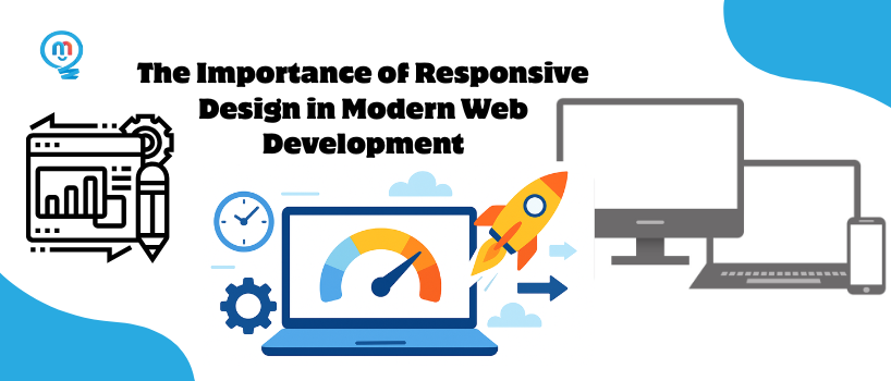
You can access a website from a smartphone, laptop, tablet, and even a smart TV. No matter what device, people want a good experience that is easy to use. That's why responsive design is imperative. Responsive design today is a must instead of being something that is merely nice to have. Responsive design is at the center of all live websites.
This blog will closely examine the importance of responsive design in today's web development for all kinds of websites, and explain why responsive design is important for online success, and how you can implement it into your own web projects.
● What Is Responsive Design
● Why Responsive Design Matters Today
● Key Benefits of Responsive Design
● Real-World Examples of Responsive Design in Action
● How to Implement Responsive Design Best Practices
a. Common Mistakes to Avoid
● Conclusion
● FAQ
Responsive design is a process that embraces change in a website's appearance depending on what device is being used. It doesn't matter if someone is using a phone, tablet, laptop or smart TV, the website will "respond" to the present device and adjust to ensure everything is readable, usable and navigate-able.
Instead of having separate versions of the website for each new device type - a web developer will make a layout that can scale, stretch, shrink and rearrange itself.
The concept isn't just about making everything smaller - it's to attempt to provide a consistent experience of sorts and an enjoyable experience regardless of what device a user decides to use.
● Flexible grids: The layout uses percentages to create the layout, therefore whatever the size of the device, the elements on the page will resize based on it.
● Responsive images: Images are able to change dimensions but maintain their quality and the overall design of the page
● Media queries: Special CSS rules that allow the developer to define how the website will display based on the device size.
● Mobile-first: Develop for the smallest screen and gradually include larger screen sizes.
Most website traffic will come from a mobile device, not a computer. When visitors usually use the sites, they are typically on the go. They might check your website quickly while on the bus, watching TV, or waiting in line. Statista says over 58% of all web traffic comes from phones, and that number continues to climb every year.
Whether users are looking something up quickly during lunch or scrolling through at midnight, they expect a website to load the same on a phone as it does on a computer. Having a mobile friendly website is no longer just a nice feature, it is now expected.
Since 2019, Google has been prioritizing mobile versions of websites in regards to indexing. This means the mobile version of your website is what matters in how well your website will display in search results to visitors.
Visitors should not have to pinch and zoom to read content or find a button. Responsive layouts keep navigation intuitive, formatting simple, and facilitate users to quickly find what they need.
Responsive websites are favored by search engines. Google has suggested that responsive web design is the best approach to mobile configurations, as it has better bounce rates and improved time on page - two major factors in ranking results.
With responsive design you optimize your assets based on screen size. When screens get smaller, image sizes also get smaller automatically, and you avoid loading unnecessary scripts. All of this leads to higher performance and faster load speeds can be critical in mobile networks.
You use one set of code for both phones and computers, not two. When you need to update or fix issues, you do it once, and then all devices get the changes at the same time. This keeps things simple and makes sure everything works well.
When using a responsive site you lower friction in the buyer's journey. For a person filling out a form or purchasing something in mobile, a drastically improved mobile experience can increase conversions rates.
Responsive design is not purposefully built with screen sizes in mind, it is designed to adjust.
At times, seeing design in action helps us get it. Here are some big names that use smart design daily:
When you book a room from your laptop or check your trip on your phone, Airbnb's design shifts to fit your screen.
Text looks sharp on all screens, buttons are easy to tap, and all works the same no matter the device.
Even with tons of info on Amazon—like product info, reviews, and deals—the design adjusts to your display.
This makes buying smooth and easy, whether on a phone or computer.
The BBC site has a grid and text that adapt based on your screen size.
This makes news, titles, and pictures clear and simple to read, no matter the device.
Stay away from set-width spaces. Use widths by percent, units like (em, rem, vw, vh), and start with mobile styles in CSS.
Media queries let you set different styles for different screen sizes. This keeps the look the same on all devices.
Use smart image methods like the element or srcset to bring in the right image sizes for the screen.
Buttons and links need to be big enough to tap. Small sites annoy users on touch devices.
Use tools like Chrome DevTools, BrowserStack, or Responsively to check and fix how it looks on different devices.
Even if you mean well, it's easy to slip up when making things work on many devices. Here are some points to watch:
Set pixel sizes in tough layouts can break on small screens. Use bendy units like %, rem, or vw to keep it easy to change.
Without this, phone browsers can't size your site right—this leads to odd zooms and broken looks.
Simulators help, but they don't always show how real folk use your site. Be sure to test on real phones and tablets too.
People on phones still want all the goods. Don't cut stuff out; change the layout to keep key things easy to see and read.
Big images, big scripts, and slow things make loading slow. A swift site matters; it's a must, more so for phone users.
Responsive design is not just nice to have, responsive design is a necessity. Given that, everyone is using so many devices, if you do not have a responsive design, you will lose people viewing your work, engaging with you, and making purchases.
Responsive design is not just important for portfolio websites, online shops and business websites now, it is important. It dictates how users view things, improves SEO, and shapes how people perceive your brand online.

Is responsive design only about mobile?
What tools can I use to check if my site is responsive?
How is responsive design different from adaptive design?
Do I need a developer to make my site responsive?
How does responsive design impact SEO?